
This is the photo I will be using for my front cover, as you can see the model is giving a direct mode of address that most magazine front covers give. I also liked how I got the lights to give a more mysterious look to my model with the shadows on the face. As well as, the background for my photo is very simplistic so it would easy for me to photoshop. Further more, the direct mode of address would draw in certain audiences who would see my models face and might be interested in my magazine.

This photo appealed to the most for my double page spread because the model wasn't giving a direct mode of address that I wanted, also the props in the picture (backpack) gave more R&B feel to the image, and again the background was plain and simple, so it would be very easy to photoshop, also the picture was very dull and dark, so i would have to photoshop a more bright, warm fell to the image.

At first this photo gave me mixed feelings, but I decided to use it for my contents page because I didn't want to use a different model for my contents page, unlike my front cover and double page spread, which have the same model and if I did use a different person the style would be lost, so I wanted to keep a house style throughout my magazine and to show it's an R&B magazine.
For these three images I thought about my props,
location and lighting. Firstly I decided what I wanted my model to wear, which
I told him to wear a tracksuit or black clothing to emphasise that R&B
vibe/feel to my magazine. Then I told him to bring a jacket or bag, to enforce
my R&B vibe. For location I wanted a plain and simple background, so it
would be easy for me to Photoshop and play around with, or create my own
background. For lighting I used indoor light or outdoor lighting to
create silhouettes on my models face or having contrast with the light or
dark, my problem for most of my images were the outdoor photos because the
lighting was very poor, however I could brighten it up through Photoshop. The
camera I used was the Cannon EOS 600D, which allowed me to use
many functions and features to manipulate my photo. For different
compositions I wanted different angles and shots for each page, so for my front
cover I wanted a close up, with direct mode of address, so my model is looking
directly at the audience, making them intrigued to read my magazine. Compared to my double page spread which is a taken by a mid shot of my model but he is looking away from the camera, making him seem uninterested and doesn't care. I also did this with my contents page by making him look away from the camera, but I took the image from a low angle shot, making the audience seem less powerful and giving my model power and status over them.

This photo gave a more classy look to me, because of how the light created a silhouette of my model and by using my camera in manual I created a white line sharping the edges of my model. Also, the image was bright, which made it eye-catching also I told my model just to wear a cardigan or jacket, to keep the image simple and just to give a casual look to my contents page.


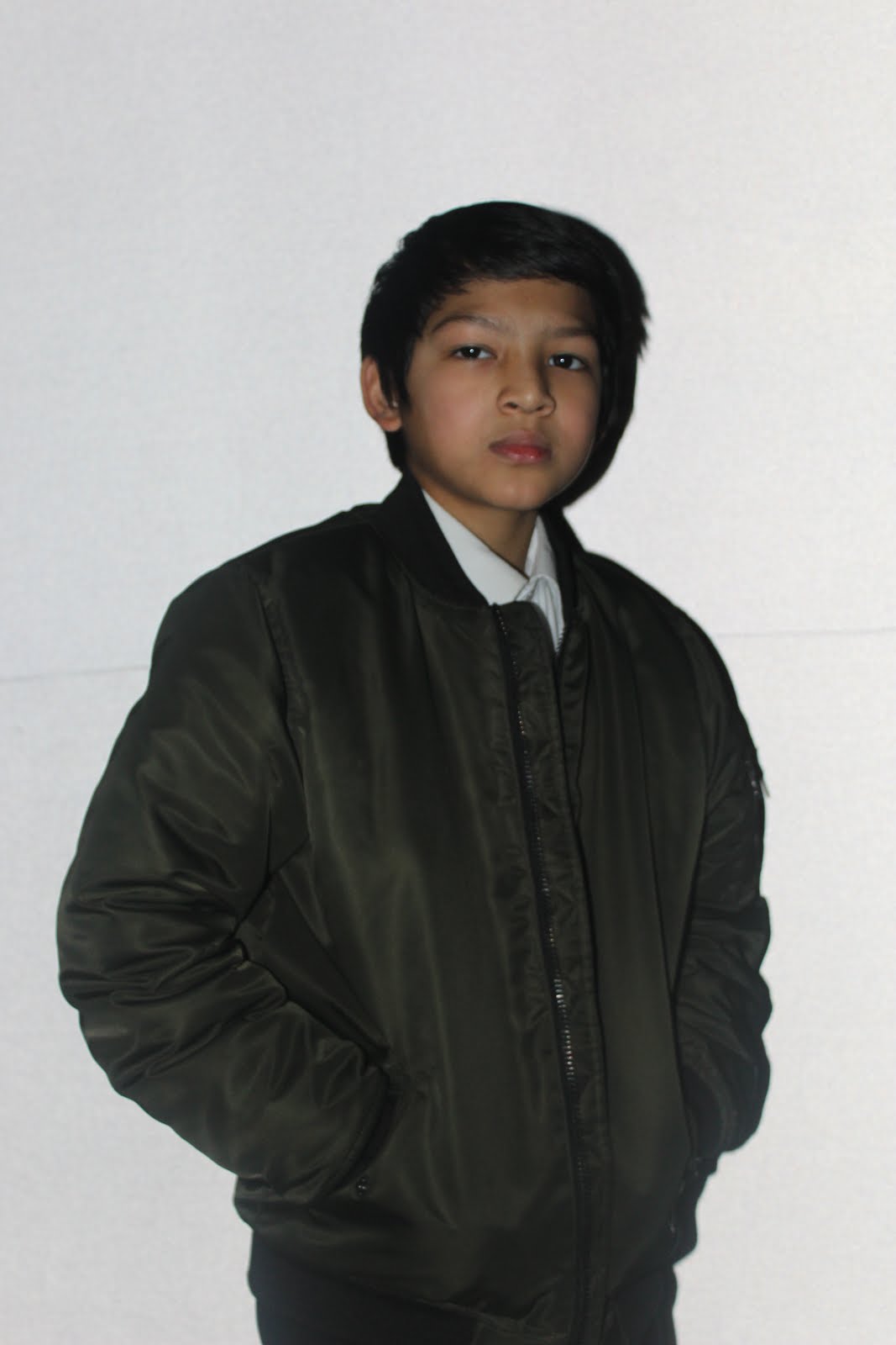
For these photos my main model (Shahir Miah) I made him wear mainly tracksuits to give off a R&B vibe, as well as, he's wearing a bag to give off a young style to him, also taking different facial expressions, compositions and mode of address. I took a lot more photos than I needed just to get a wide variety of shots.


For these photos my second model (Ibrahim Uddin) for my contents page, I then realised that my model wouldn't fit in with my contents page and to my style of my magazine, so I decided to get someone else.


These photos I took are for my contents page, my model 3 (Danny Caswell) had less photos because after a few shots I knew I would use these photos because for my contents page I wanted to have a mid shot of my model looking at the camera or looking at something, and if you can notice on my contents page photo you can see a white line around my models head, this was done by the light and manually focusing the camera.


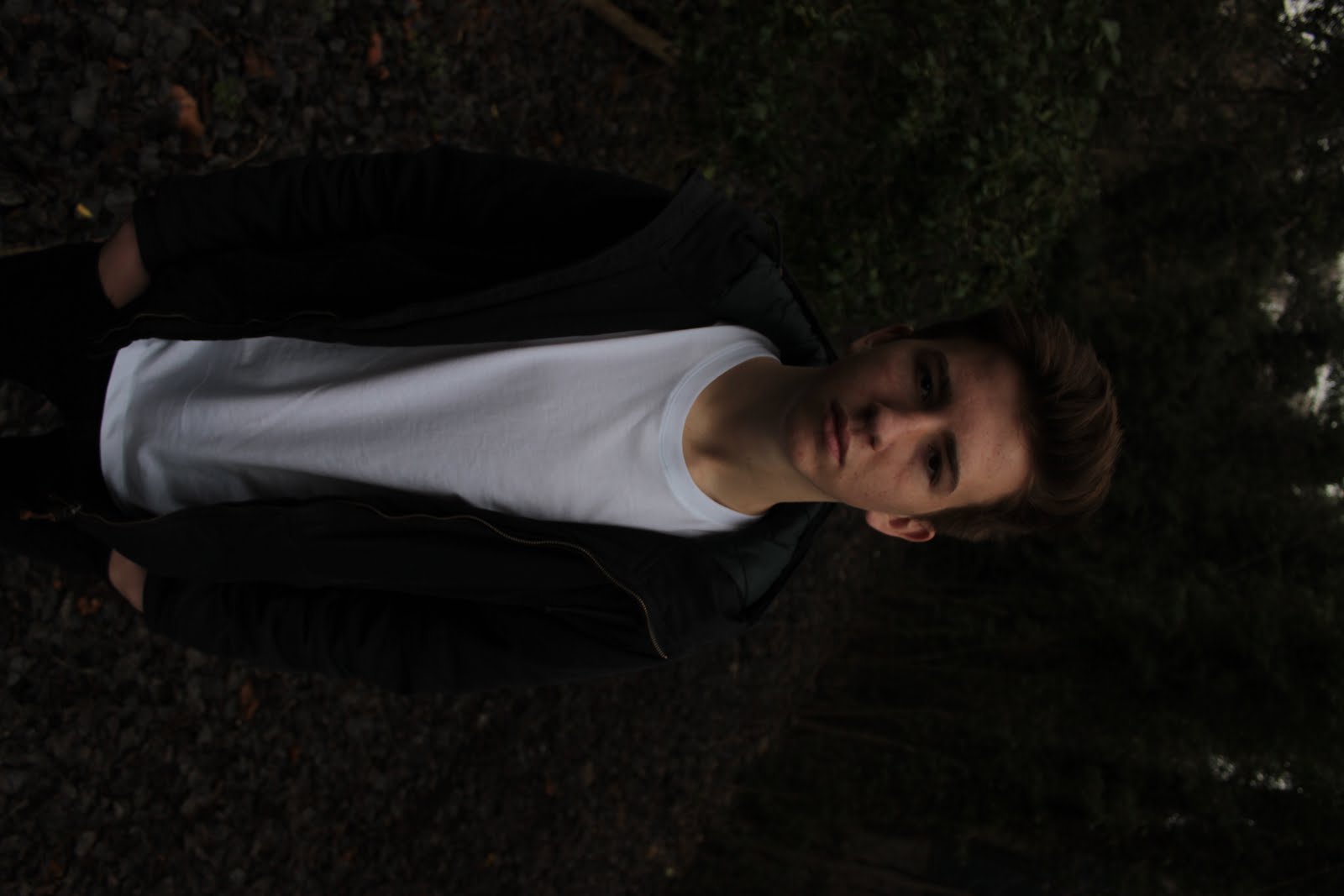


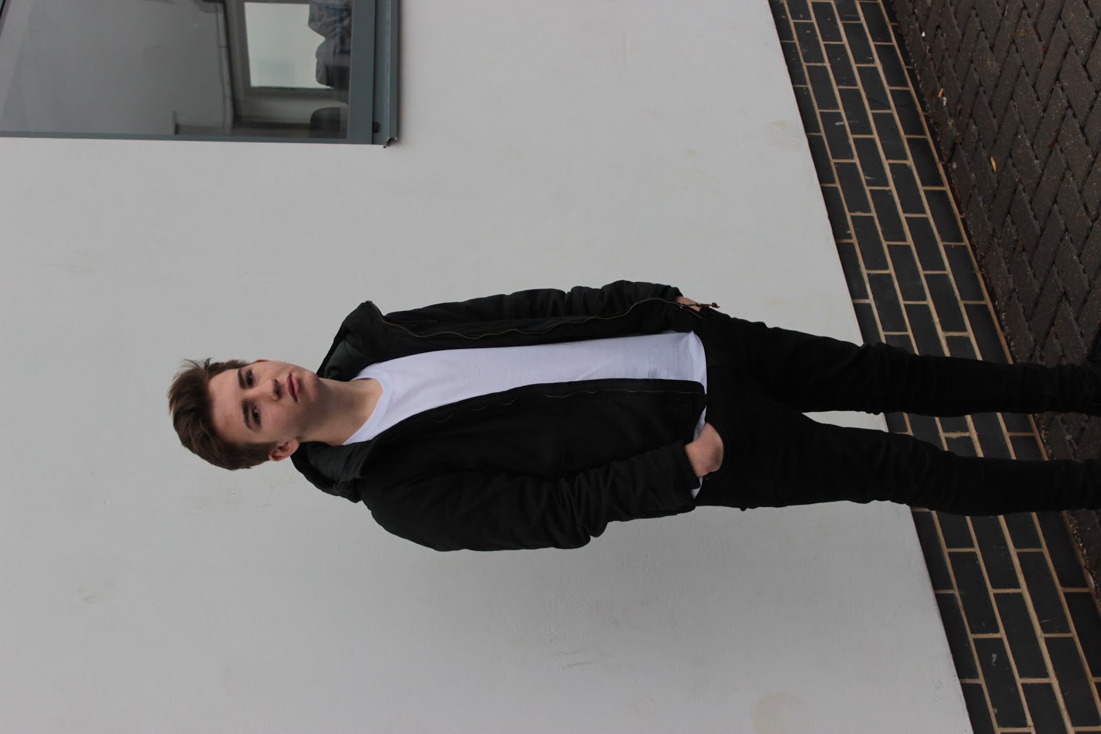


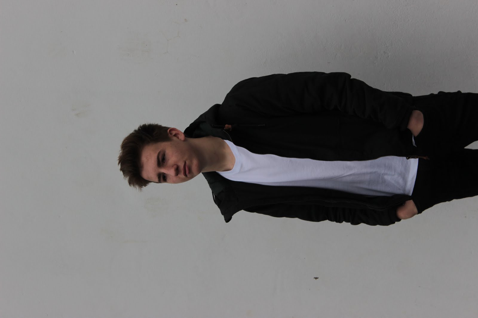


For these images this is my 4th model (Max Adzet-Mauchline) I did a lot of photography for this model because I wanted to get various shots for my double page spread I did some photos indoors, which my the photo become a yellowish tone, which I hated. Then I did some photography outdoors, that I mainly did near solid plain backgrounds, so it would be easier for to photoshop, then I did some in a forest, which made the lighting very poor, but I didn't worry to much because I could fix it on photoshop. Overall, I didn't use this model because I decided I would lose my house style if I used different models to create my magazine; and by stereotyping my magazine didn't fit white male figures but rather, mixed race, black, or Asian. So, at the end I decided to only use my main model Shahir Miah for my front cover, double page spread and contents page.
These Photos are for my Preliminary Task that I took


No comments:
Post a Comment